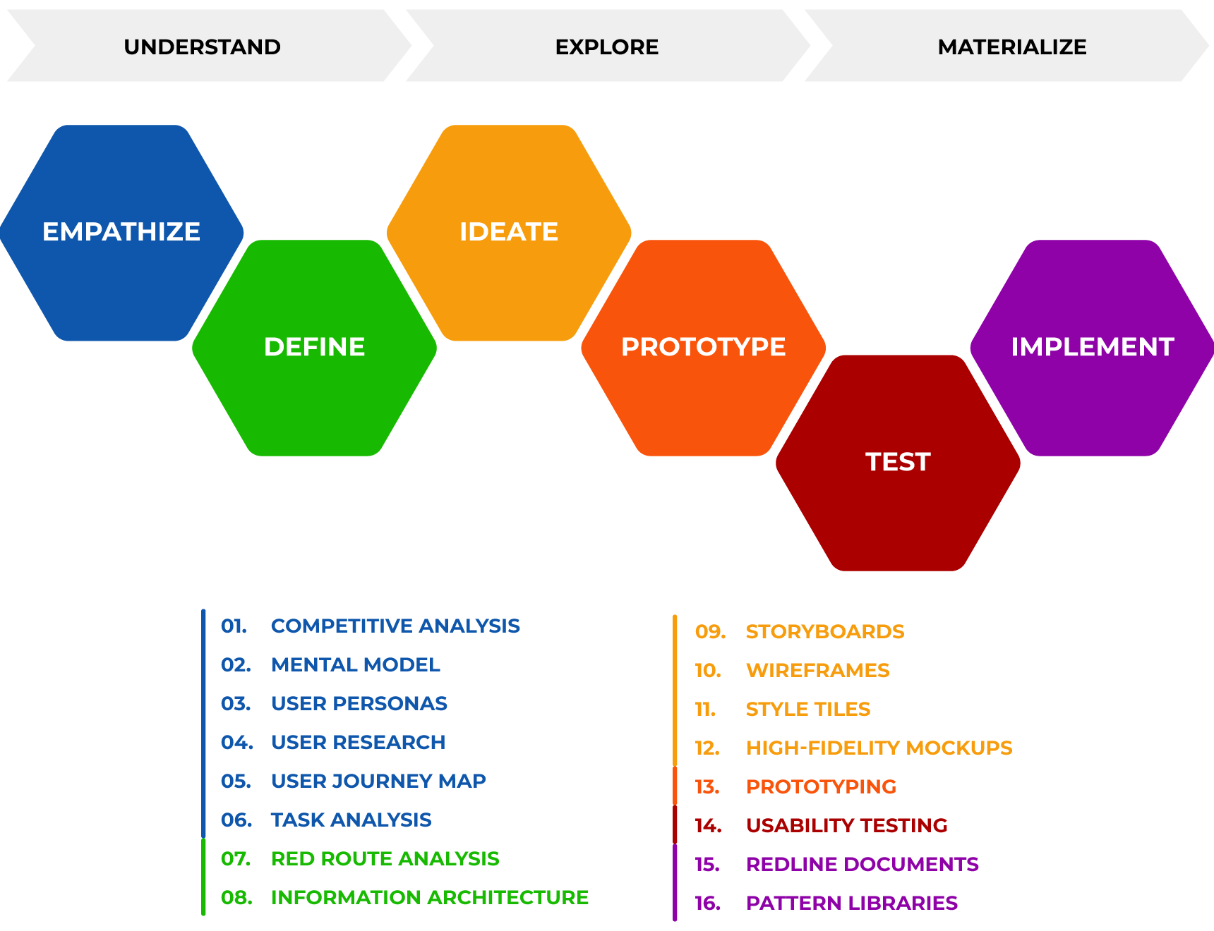
Overview of my design thinking process.
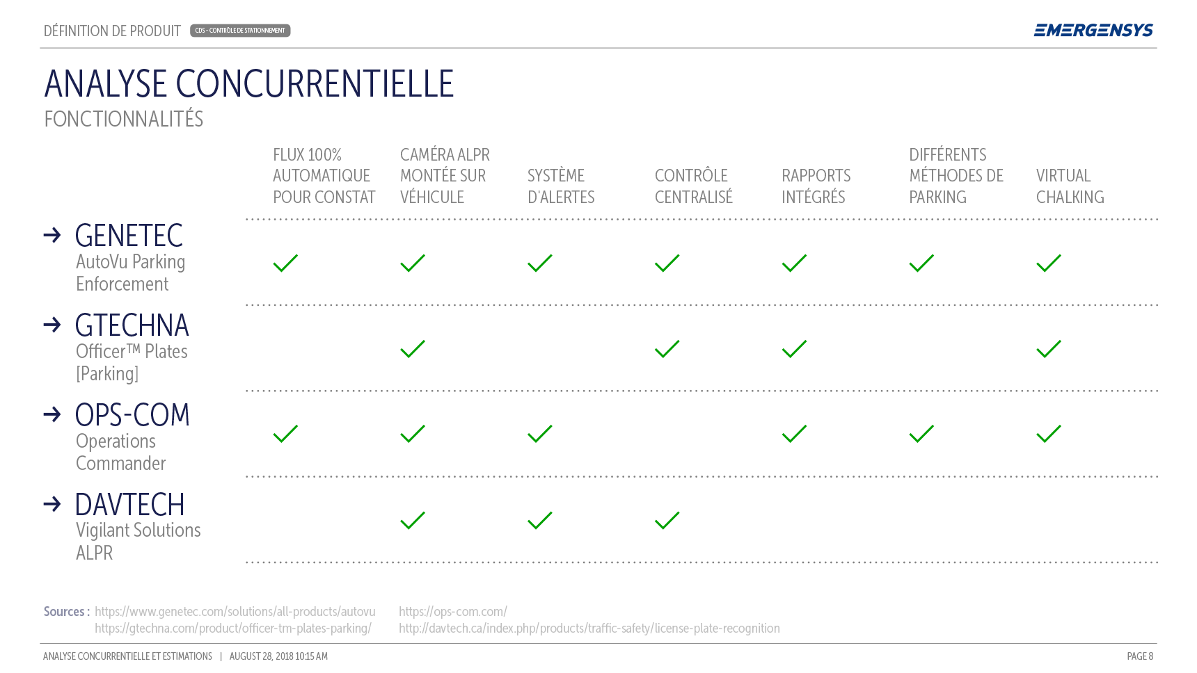
01. Competitive Analysis
This is where we evaluate the strengths and weaknesses of our competitors and compare them with our user's needs. The competitive analysis is a useful tool to assess how our product features stand against the competition and even find any market gaps to work with.
Here are some examples of competitive analysis created for projects I worked in. You can read more about that in the Portfolio section.
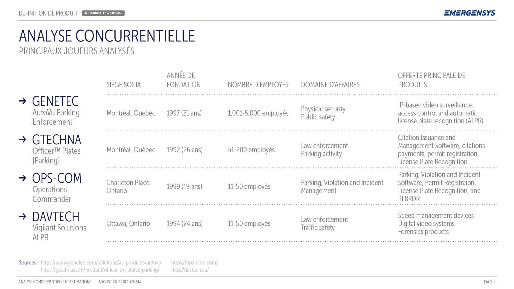
Example of a Competitive Analysis.
02. Mental Model
The mental model offers an extremely helpful visualization of the user's motivations, needs, behaviors and pain points, collected from contextual observation and real data. We then map those behaviors to our features so we can see what solutions our product can offer or what opportunities we can work on.
03. User Personas
Personas are a composite archetype of user's shared behaviors, motivations, frustrations, and goals. It's the perfect place where to summarize all the data from the mental model and one excellent tool to keep all the players involved in the development process on the same page regarding whom we are creating an experience for.
Here is an example of an User Persona created for a project I worked in. You can read more about that in the Portfolio section.
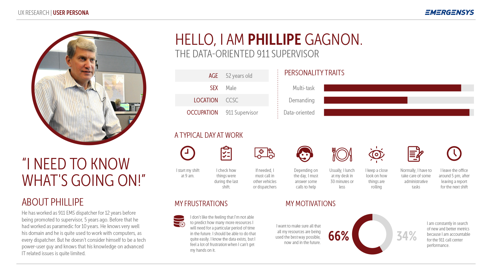
Example of an User Persona.
04. User Research
Although User personas, Task Analysis, and User Journey Maps are documents that can also be included in the user research stage of the process, I like to outline it in a separate item because that are many other research initiatives that can fit inside it.
Usually done in the early stages of a project (note that there are research methods that fit in the whole spectrum of the design process), user research encompasses both quantitative and qualitative techniques. The goal is always the same: to understand user behaviors, needs, and motivations through interviews, observation and feedback techniques.
Here are some user research sample materials created for a project I worked in. You can read more about that in the Portfolio section.
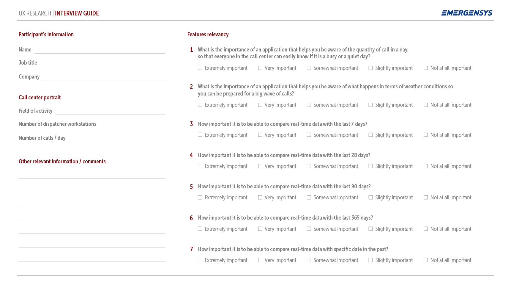
An interview guide help us direct the conversation toward the topics and issues we want to learn about while interviewing users.
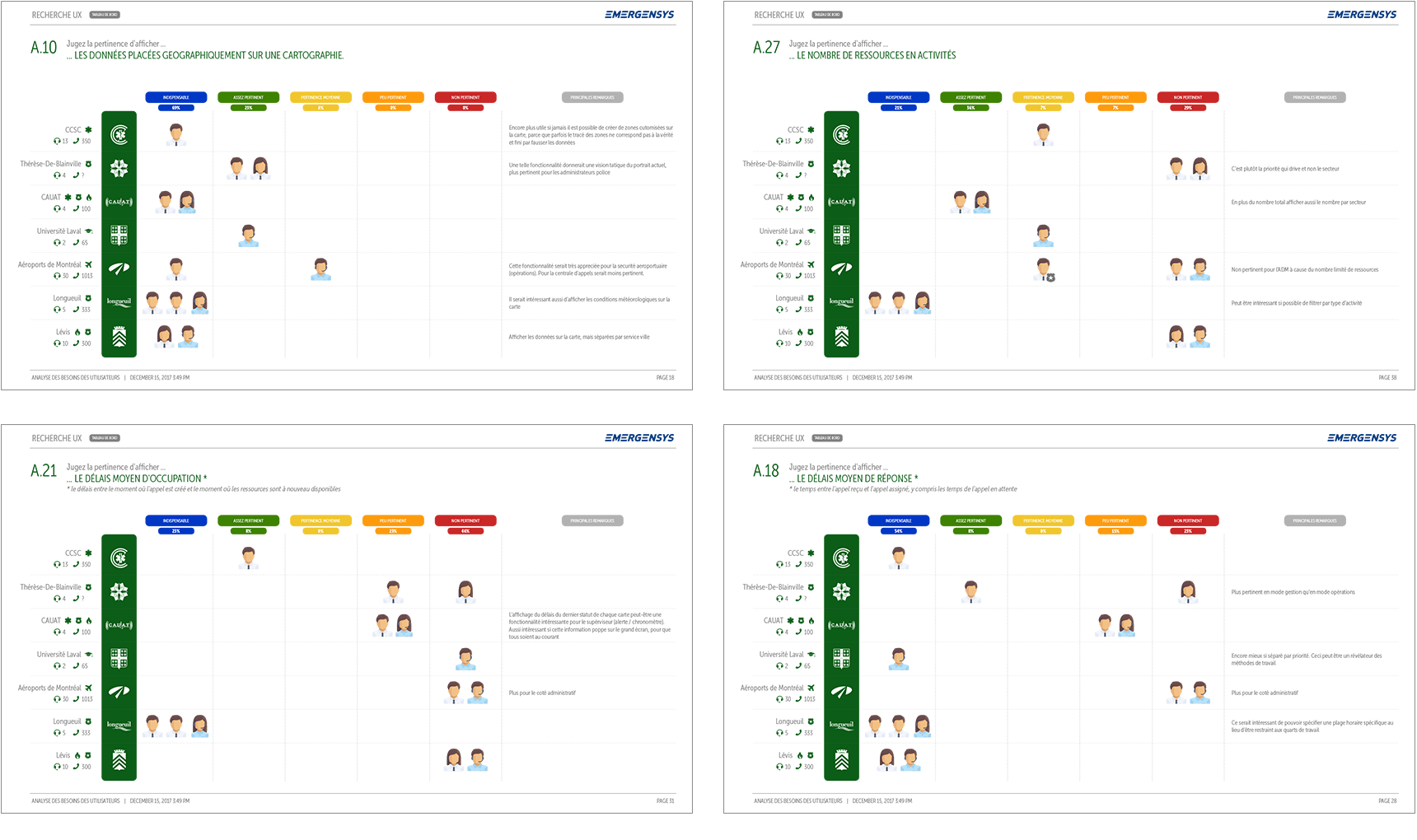
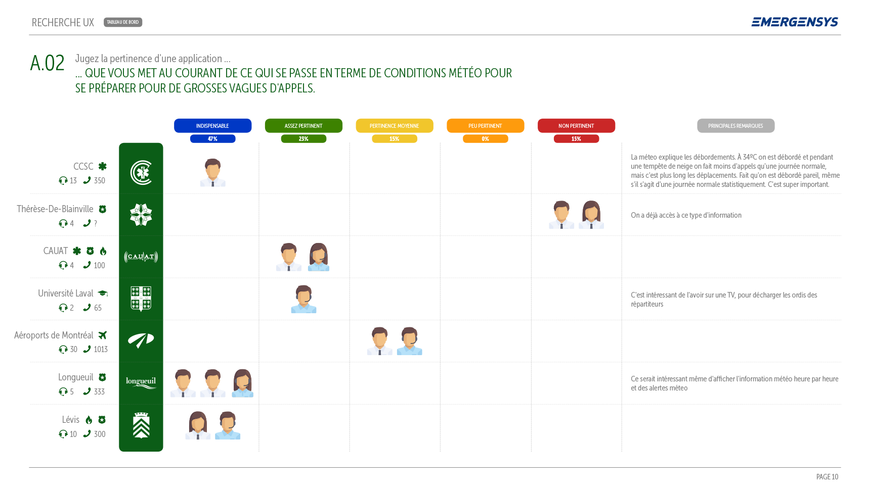
Compiling the findings of your user research is crucial to better direct design decisions. Communicating research findings in an efficient way is also important so stakeholders can understand them and know how to act on our recommandations.
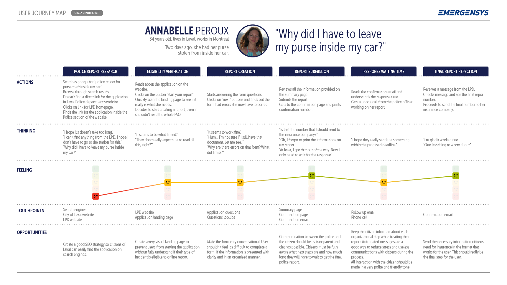
05. User Journey Map
The most important thing to keep in mind while creating a user journey map is that every interaction an user has with an organization has an effect on satisfaction, loyalty, and brand awareness. The journey map is an amazing tool to plot out the user's emotional landscape path so we can detect key opportunities for strengthening those relationships. The ideal user journey map will examine how the user currently interacts with a product or a company, will highlight pain points and detect important opportunities for building a better experience for users.
Here are some examples of User Journey Maps created for projects I worked in. You can read more about that in the Portfolio section.
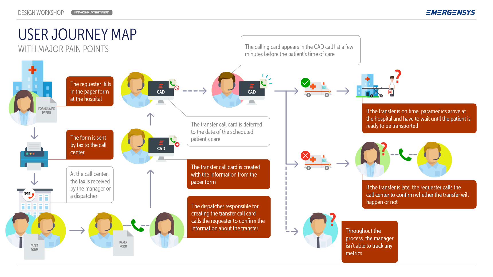
Example of an User Journey Map highlighting major pain points for the user.
Another User Journey Map detailing the user thinking process while using an application.
06. Task Analysis
The task analysis can be very useful to understand our user’s goals, by listing all the steps they take in order to achieve them. This process is very handy when it comes to figuring out how users devised ways to work around problems with a current product or solution that we eventually want to replace. In order to create an efficient way of improving their experience, the task analysis can also be a good way to foresee the influence that a certain physical environment has on the users while trying to accomplish a goal.
Here is an example of task analysis created for a project I worked in:
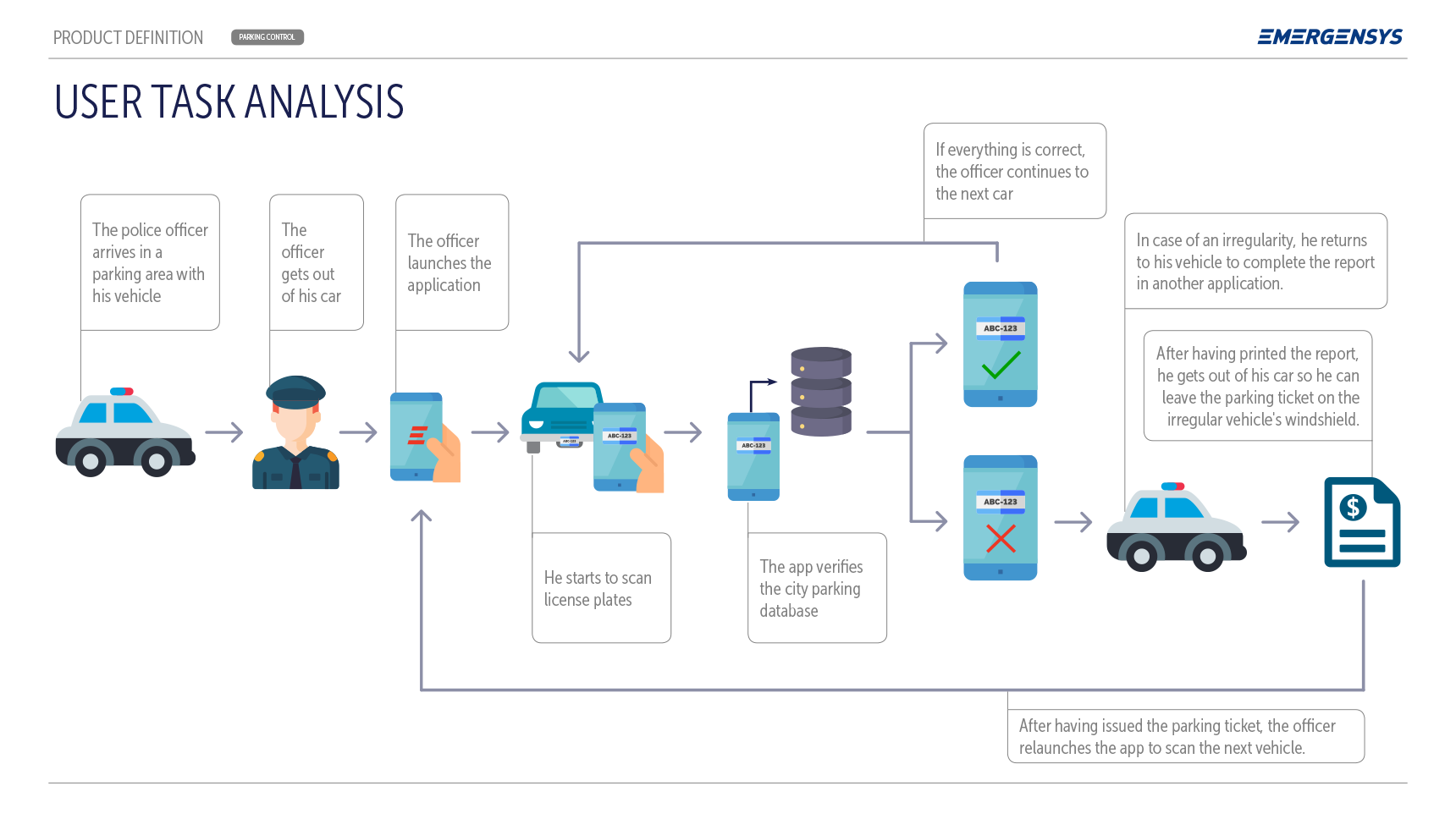
Example of a task analysis for an app where physical context definitely impacts how users interacts with the product.
07. Red Route Analysis
The red route analysis is a tool to help us prioritize key tasks within our product, so we can properly identify the activities that matter the most to our users. The term “Red Routing” was coined by Dr. David Travis while comparing the improvement in speed and experience in a product with the red routes streets in London, created precisely to optimize the flow of traffic in a city clustered by vehicles. According to him, red routes must be complete activities rather than simple tasks, their success must be easily measurable, and must be based on real user data. Basically, red routes (also known as top tasks), are an excellent way to anticipate user needs, guide usability tests, target essential features as well as reduce unused ones.
08. Information Architecture
IA is the art and science of organizing and structuring the content of a digital product. According to the IAI experts, information architecture is the practice of deciding how to arrange the parts of something to be understandable. In the prism of a UX process, the IA step is very important so the parts of a product can be understood not only by users but by all the players involved in the process. That means that a good IA document can guide not only the wireframe by visual designers but also the creation of user stories by product owners for development teams. The output of the IA work can be delivered in the form of a flow diagram, a sitemap or even wireframes. Either way, the IA document is an encapsulation of all data collected and digested through all previous steps in the process.
Here is an example of information architecture created for a project I worked in. You can read more about that in the Portfolio section.
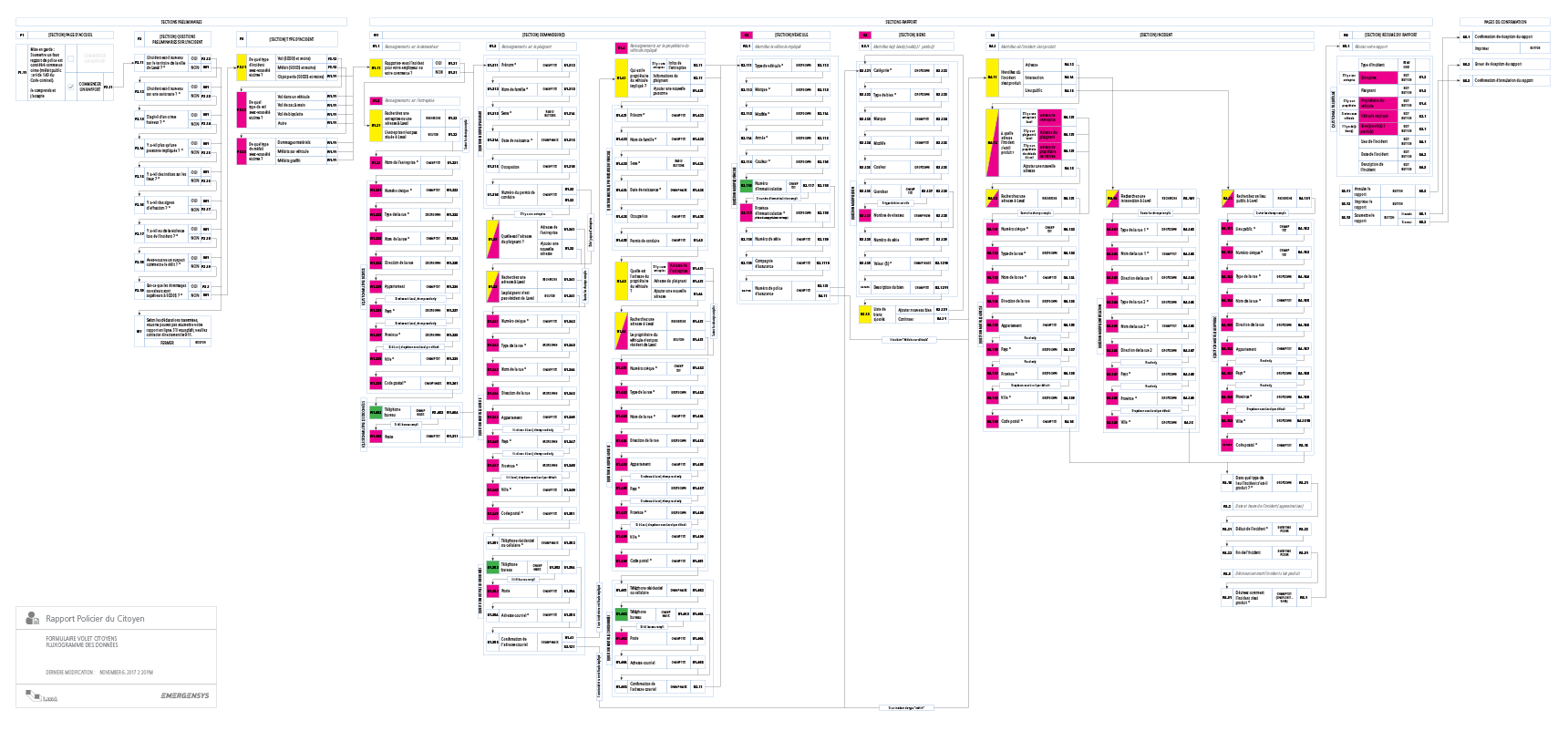
Example of a AI flow chart diagram for a web application.
09. Storyboards
Storyboards are a very important step in the movie industry. It allows to visually predict and explore how audiences will engage with a particular scene of a movie. In UX, storyboards can help communicate with several players in a project (not only the UX team) how users will engage with our product. It's an excellent way to get everyone on the same page and to force thinking about the user flow. Being a visual storytelling tool, storyboarding in the UX process is a wonderful team-based activity that helps solidify the vision for the product at hand.
Here is an example of a UX storyboard created for a project I worked in. You can read more about that in the Portfolio section.
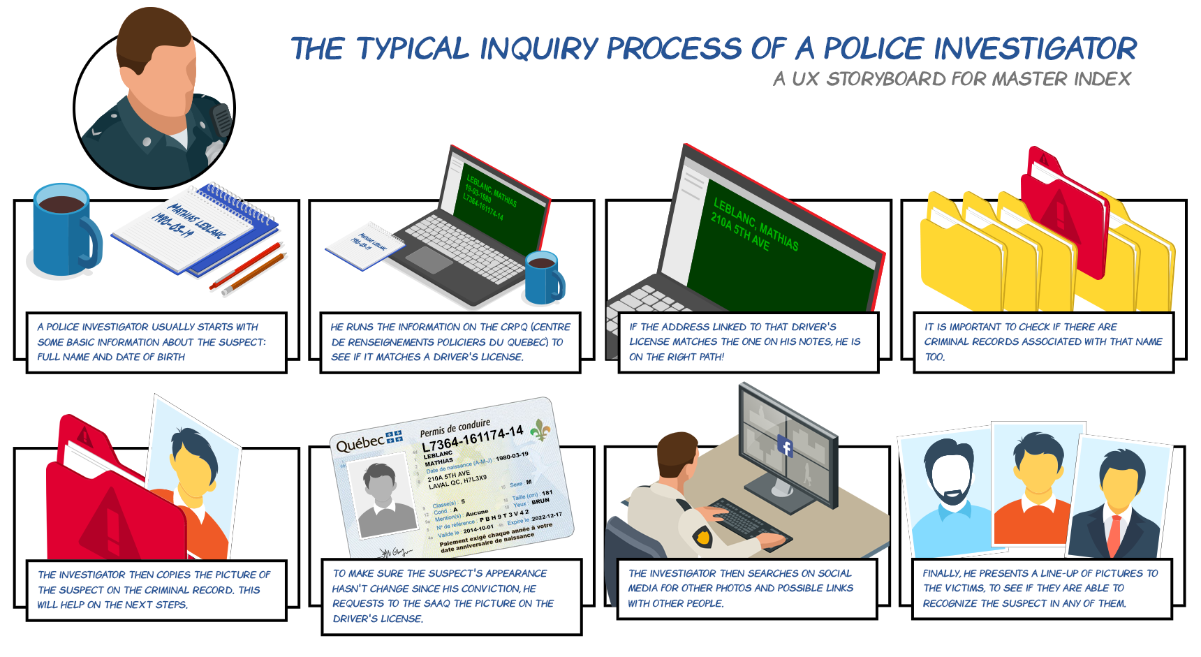
Example of an UX storyboard.
10. Sketches & Wireframes
Wireframes are a simplified visual representation of an interface, without (almost) any visual design or complex elements. It's a good and quite fast way to get the overall organization of the main elements of a product. As usual, there's actually no formula for creating wireframes. It can be done on a whiteboard, using pen and paper or a design software.
The complexity of the visual elements on the wireframe will depend on the type of project and the need at a specific step on the process. Since they are fairly quick to work with, they are an amazing tool to explore possible options at any step in the process. Generally, wireframes are also an excellent way to illustrate the user flow of an application.
Here are some examples of sketches and wireframes created for projects I worked in. You can read more about that in the Portfolio section.
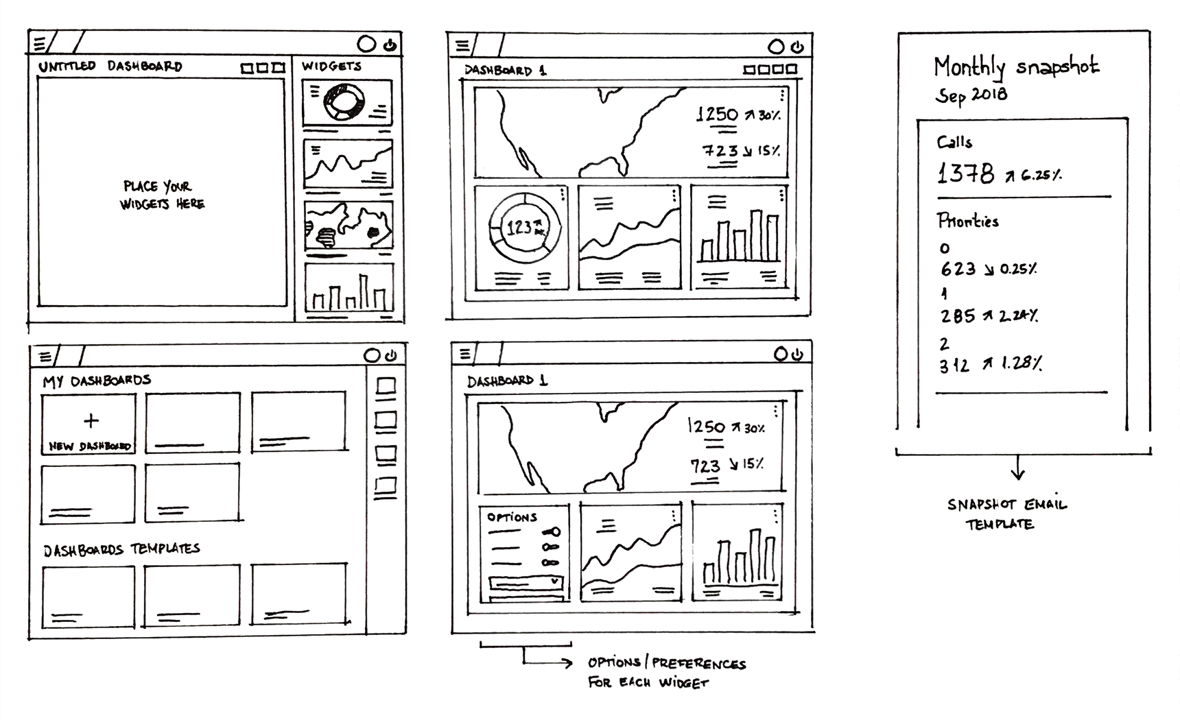
Example of a sketch wireframe made with pen and paper.
Example of a wireframe with user flow.
11. Style Tiles
Style Tiles are a deliverable consisting of colors, typography and all other interface elements that convey the essence of the visual design of a digital product. They are very important and useful, especially when working with several designers and UI developers. It also can be used as a mean to get easier and quicker buy-in from stakeholders before working on too many high-fidelity mockups.
Here is an example of a style tile created for a project I worked in. You can read more about that in the Portfolio section.
Example of a Style Tyle.
12. High-Fidelity Mockups
Generally speaking, high-fidelity mockups fill in the details missing in the low-fidelity wireframes. I like to think about them as the closest representation of the final product. They are amazing tools to communicate form and function to developers, stakeholders, and customers. Personally, I prefer working with high-fidelity concepts, especially while working in an environment with a low level of UX maturity.
I've learned by experience that people in those environments tend to struggle with low-fidelity deliverables because they find them too abstract and hard to imagine the final product. On the other hand, companies with strong design cultures tend to function quite well with wireframes. Nonetheless, even if big companies are able to work well with wireframes, they still dedicate a whole lot of attention to high-fidelity mockups, because the attention to detail and strong visual design are important aspects of their design culture.
Usually, I try to make the production of high-fidelity mockups be simultaneous to the creation of high-fidelity prototypes. Alongside with good scenarios, this can be a powerful tool of presentation and testing.
Here is an example of a high-fidelity mockup created for a project I worked in. You can read more about that in the Portfolio section.
Example of a high-fidelity mockup.
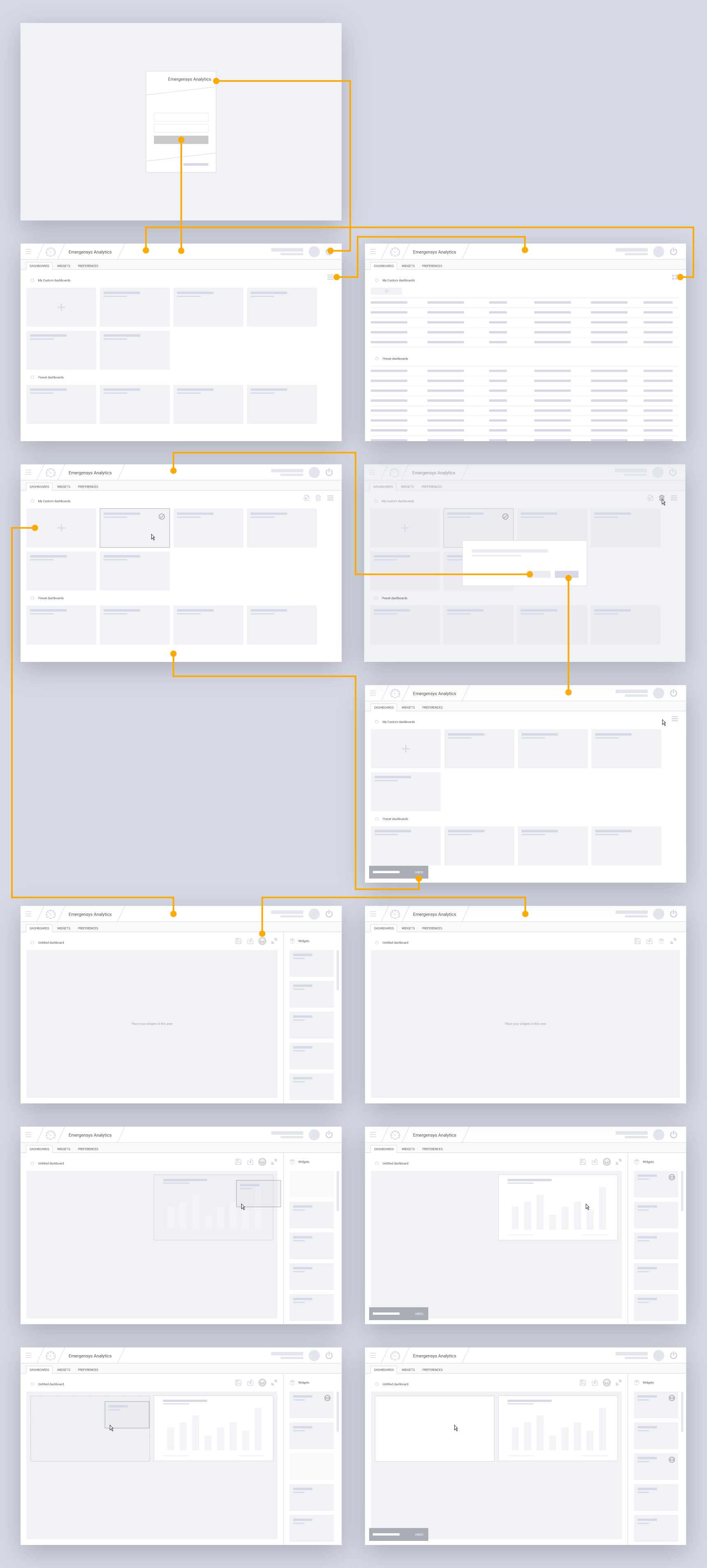
13. Prototyping
Prototypes are one of the most important steps in the design process. In terms of deliverables within the UX world, however, a prototype can mean many different things. All those different kind of prototypes vary in style of representation (a prototype can be made of paper or code), in the degree of interactivity (it can be fully functional, partial or view-only) or level of precision (fully detailed with high-fidelity concepts or simple with wireframes). Like always, it depends on the requirements and timeframe for each project and, most of all, on the problems you are trying to solve throughout the design process.
Clickable prototypes are very useful because they allow us to test for much more than a simple view-only prototype. Nonetheless, I'm always inclined to create different small prototypes during my design process because I found them to be excellent tools to communicate ideas, not only to customers and stakeholders but especially to developer teams and product owners.
Here are some examples of prototypes created for projects I worked in. You can read more about that in the Portfolio section.
14. Usability testing
Usability tests are usually done after the prototyping phase because we must have something concrete to test upon. Just like prototyping, usability tests are ideally done throughout the whole process. The premise is to test early and to test often. Sometimes in real-world projects, due to tight deadlines and other types of constraints, it can be difficult to orchestrate usability testing in the middle of the ideation process. However, one should never accept to get to the end of a project without ever collecting feedback from real users. It can be tempting to some small companies or project managers running on tight budgets to skip this crucial part of the UX process, but it's proven to be a very bad idea with drastic consequences to the success of a product.
The premise of usability tests is to help designers, developers, product managers, and stakeholders to step back from assumptions and opinions by observing real users as they attempt to complete a particular task (or a series of tasks) with a product. Once again, there are many different testing techniques, but all of them will consist of three basic steps: planning the test, conducting the test and analysis and reporting findings.
Usability testing is a whole lot of work, but it's one of the most important initiatives within the UX process, as it helps to define the success path to any digital product, by keeping the user at the very center of any discussion between team members.
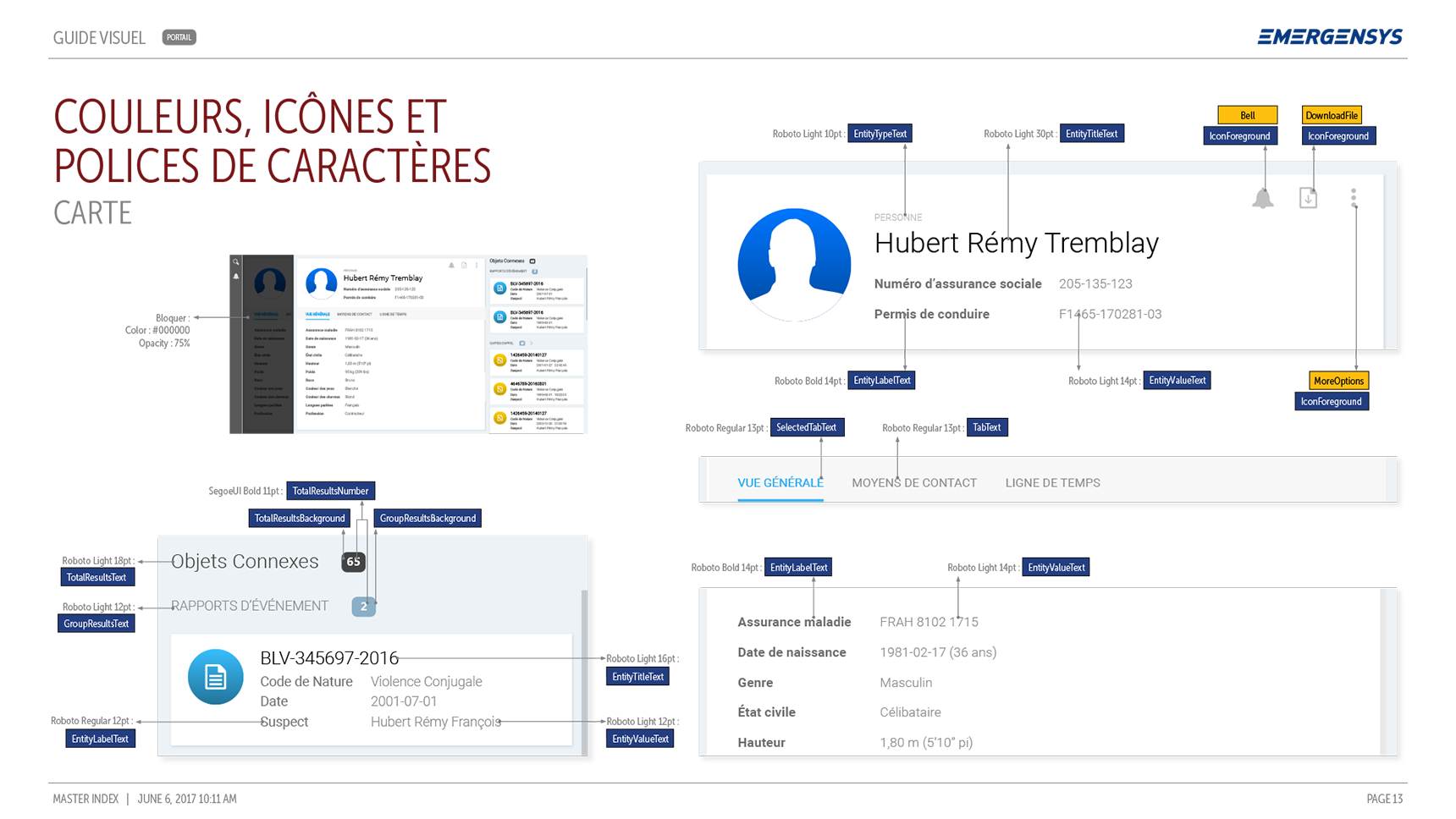
15. Redline Documents (Design handoffs)
I've seen many designers happy enough about their work up until this stage of the process. Some may even consider their work done at this point. After all, they have beautiful high-fidelity concepts to show in their portfolios and they think now that's someone else's problem to think about what's next. Nothing could be further from the truth.
When a conscious designer is done with the "visual" part of his work, he feels accountable for how UI and front-end developers (and in some cases even back-end developers) will understand concepts in order to be able to implement them properly. That's when a good discussion with developers can help define what kind of documentation is best to deliver them so they can carry on with their work.
I've worked with all kind of developers. From those who have absolutely no idea what do to with an interface to amazing UI developers. Each of them needs a different kind of design handoffs. No shortage of implementation details for the former kind, whereas the later will maybe benefit from more details about interactions and animations.
Here are some examples of redline documentation created for a project I worked in. You can read more about that in the Portfolio section.
Example of a redline document.
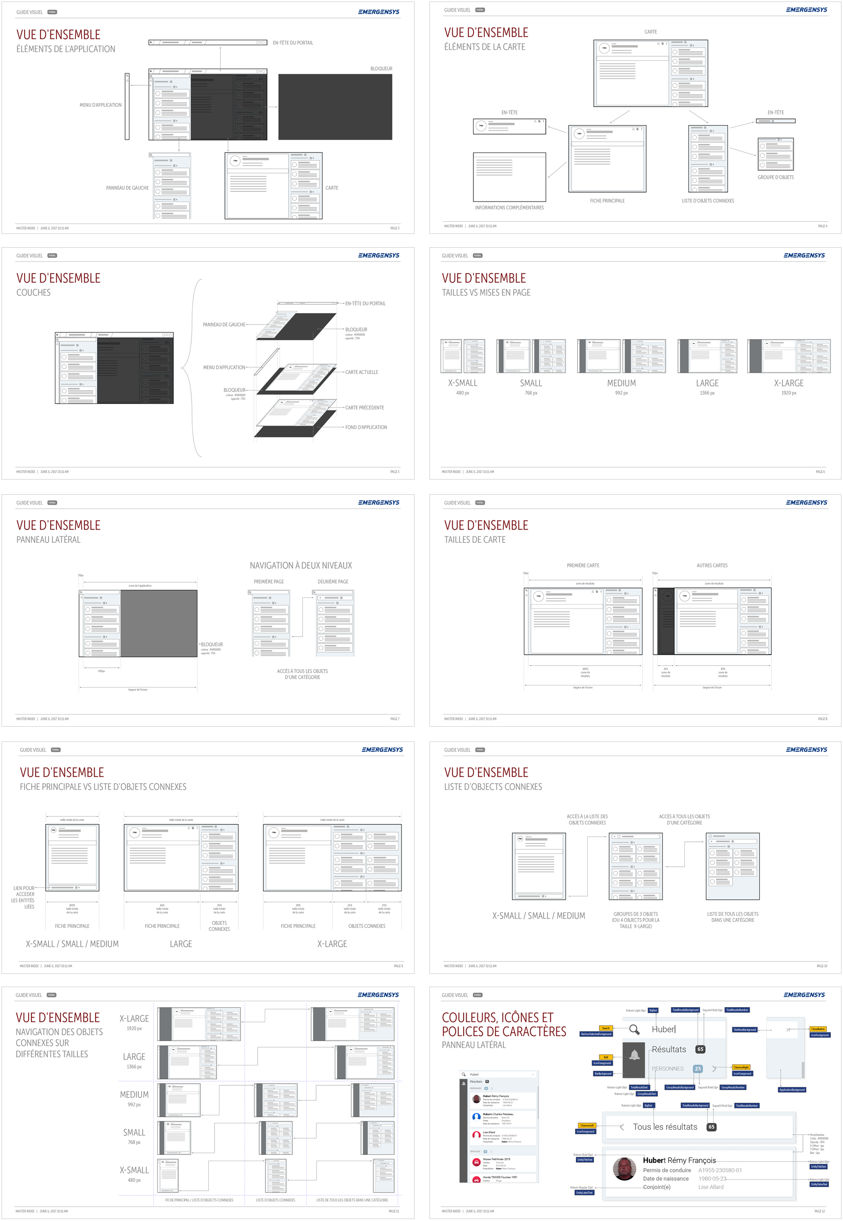
16. Pattern Libraries
There are times where designers must create interface elements from scratch. But the increasing need for implementation speed and bulletproof consistency is pushing UX teams towards Pattern Libraries.
Any reusable solution to a problem in UX and interaction design can be translated into a pattern inside a library. A pattern is a piece of interface that is reliable because it has been tested and proven. Examples of patterns are navigational elements (headers, menus, footers, paginations), selectors (buttons, checkboxes, toggles), search components (search fields, results filtering), alert elements (messaging, pop-up, notifications) and many others.
A well documented Pattern Library may serve as an excellent base for a Design Library, which is a step further in making speed and consistency inherent qualities to the work of both design and development teams.
Here is an example of pattern library created for a project I worked in. You can read more about that in the Portfolio section.
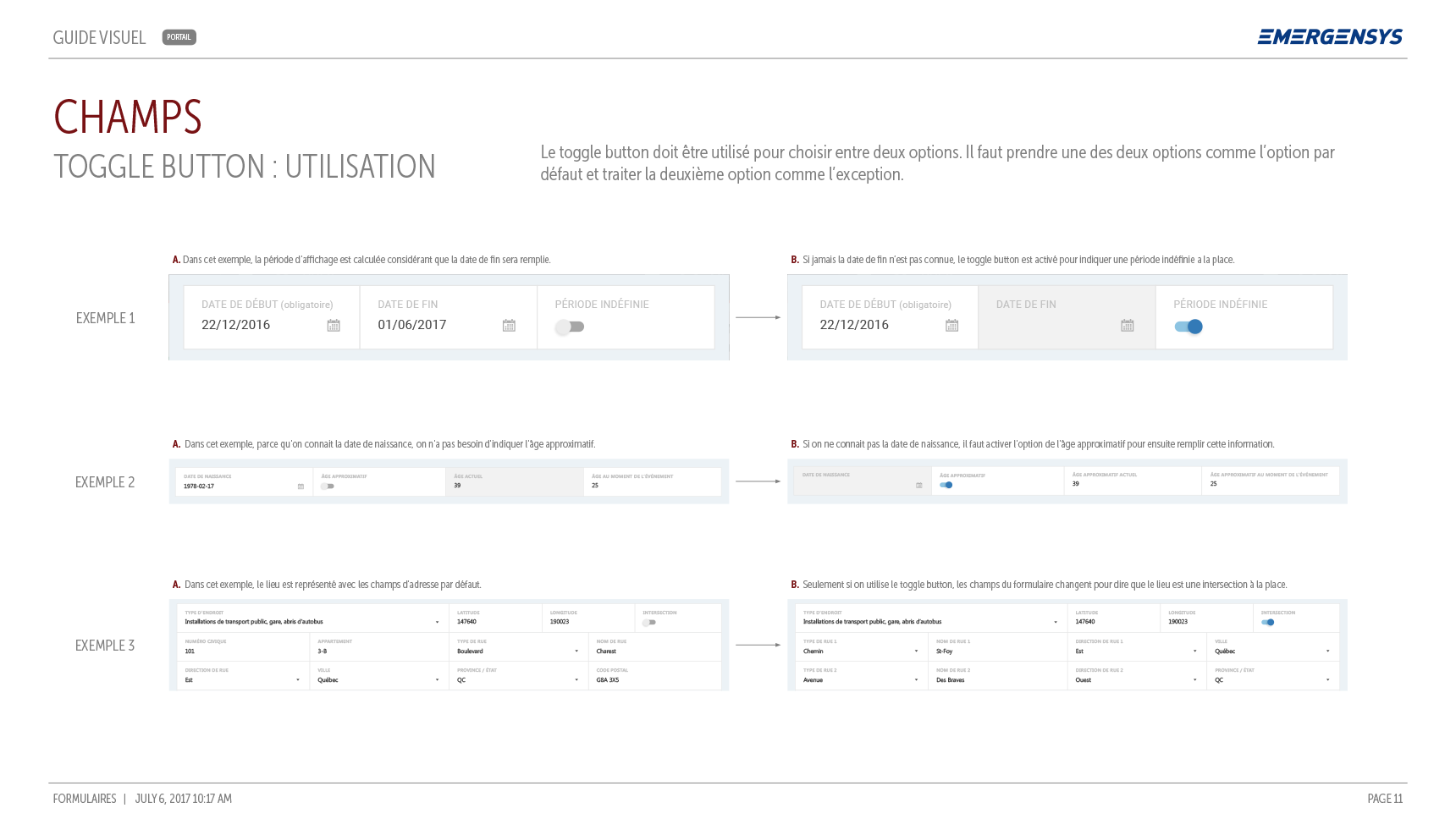
Example of a Pattern Library page detailing the behaviour and usage of toggle buttons.

Liking what you see?
Do you have any questions about my UX process?
Do you want to go into all the little details not mentioned here?
Let’s have a chat! I’d love to discuss all this with your UX team!